Since his Graffiti days, Archie or ‘Chi’ has now torpedoed his interests and efforts into changing the perception of Manila’s society into what street art’s identity, ideologies and aesthetics could be. Chi’s mixed media paintings are a play on the abstract and references from pop to baroque history deconstructed by his signature “static” style of paint application.
Chi brought his art to the streets of Cebu last March, and through an online photo contest via Facebook, Twitter and Instagram, gave social media followers the chance to submit images of their best memories wherein the winning entries was used as inspiration for Chi’s #CLASHWALL piece.

Here’s what @CHICHIMONSTER has to say:
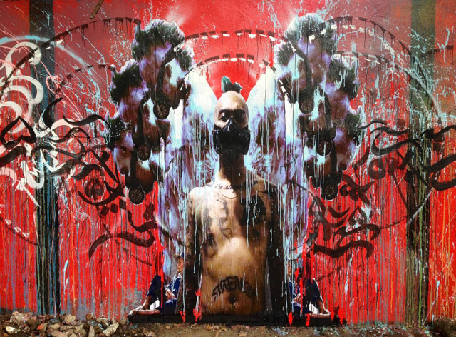
#CLASHWALL: “Strength And The Constraints Of Public Opinion”
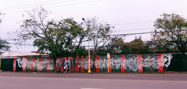
In line with the history and identity of Converse and the different sub-cultures it caters to, I created a mural mixing different elements from different cultures and mixing them all in one 200 foot long mural speaking to graffiti, skating, music, and the tattoo culture.
The brief had an interactive online strategy mechanic to communicate with Converse’s market. We requested people to send in or tag us with their favorite memories, represented by photos, through social media, and after the submission period, I incorporated their photos and filtered them through my aesthetic. The goal is to make the audience be part of the creative process, and it’s not solely just about the artist, or the brand, but a group effort.
On both ends of the mural is a screaming head dissolving into my own version of the “Baybayin” or Alibata, a lost Filipino alphabet, as the calligraphy element, essentially making it part of the illustration and giving it its own flow. Some letters of the Baybayin explode outwards from plain white strokes to color splatters and drips. It is an electric and eclectic mix of different aesthetics.
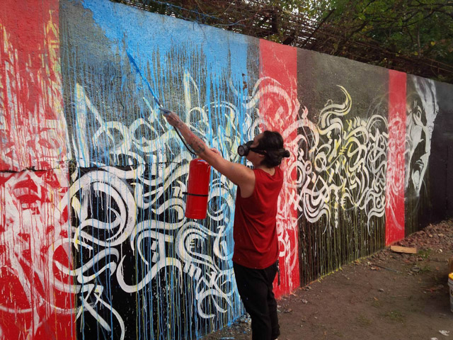
Fire extinguishers were used to give the first layer of colors and tints to the elements, creating a rainbow effect of colors to the piece. A second layering of primary colors were aplied to highlight letters and colors. Pink and blue paint splatters adorn the 200 foot mural starting from the first Baybayin letters to the centre piece, which is called “Strength”.
The flow of the piece is non-linear. It starts with no color from the centre or from both the left and right sides of the wall, to letters exploding into color, then eventually minimizing it to the center piece, which is the collage of entries where most colors are moving inward or outward and concenttrated to melt down to the floor giving the whole piece balance and cohesion.
The concept of the piece is to make people stop and look closer at the mural, to see all the details and different shades of color that are mixed by using different media. Expressing the wall mural need not be a boring simple 2D display on the side of the road. The piece actually entices the audience to come closer and spend more time disecting the elements, textures, and to see the real colors applied to the mural.


