The grit of the urban lifestyle usually does not reach the glitz and glamour of Instagram. Everything seems to be blown up to something larger than life. That is why UrbanTypeDavao, an Instagram account for urban typography has caught our attention; taking what seemed to be mundane in our everyday lives and turning it into an avenue for communicating stories.
We met up with Megan Palero, the motion graphics and visual arts designer behind UrbantypeDavao, to discuss the project and typography as a tool in shaping a city’s character.
Every project Palero has done in the past has always been a product of in-depth research and accurate representation. That is why he places so much importance in choosing the right typeface, as every typeface tells a different story at a particular point in history. This experience allowed him to initiate this project.
Palero began going out in the streets and documenting the city’s typography placements, most especially the handcrafted ones.
“It may be normal to see them everywhere,” says Palero, “But you will appreciate the beauty behind their imperfections in contrast to our strict design rules.”
When asked if he had any criteria for choosing what to feature in the Instagram account, Palero explains that it should be well-crafted and sustainable. “I rarely feature types on tarpaulin posters or in meaningless placement that are unsustainable to the environment,” he shares.
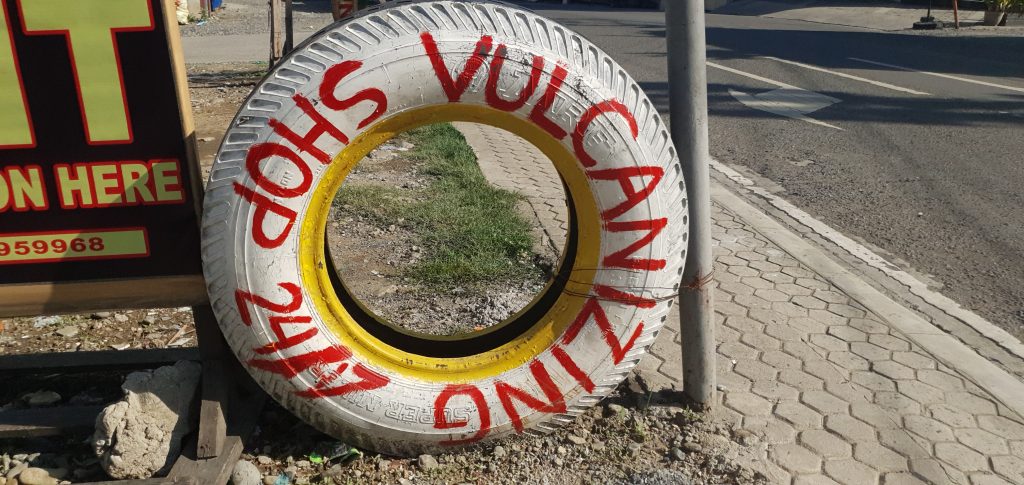
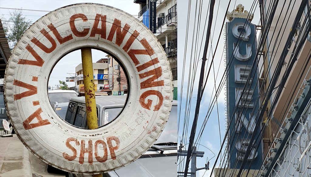
As a creative, Palero appreciates the resourcefulness of several plumbing ads which are usually made from flattened metal cans.
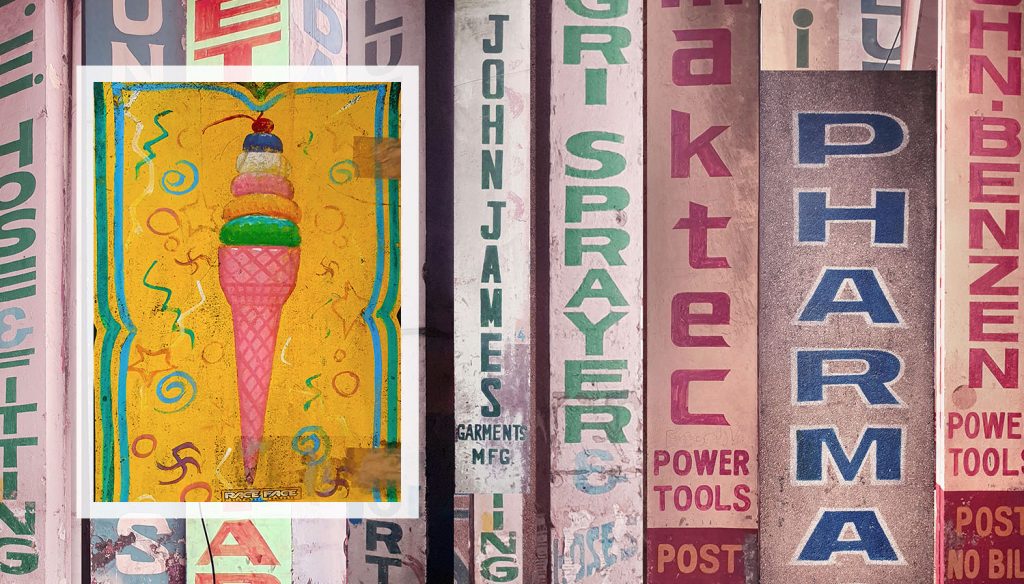
He also emphasizes on the placement’s historical value and representation of cultural identity. “Since jeepney signs are too common to feature an observation, I tried to explore any other placement of typography that entices my curiosity such as signs on hardware stores, ice cream carts, wayfinding systems, taxi logotypes, and even types on cargo containers of shipping companies.”
His goal was to use the growing popularity of @urbantypedvo as a way to accurately document what we can find in Davao since design and typography vary from city to city, and from industry to industry.
UrbantypeDavao has become an avenue for communicating the unheard-of stories of typographers to a creative, appreciative audience. Palero enjoys knowing that every typography placement he posts tells a different story for every individual. He shares that he has been receiving stories from locals who associate the typography placements with childhood memories.
Palero also enjoys chatting with the business owners who notice him taking pictures of their branding and signage. He shares of one encounter with a business owner who invited him inside the store to show him photos of the building and its logo that has stood in the area for more than 50 years.
“I’m always trying to understand by seeing them [typography] differently in my perspective and as an observation of society. By sharing type stories we are also rediscovering the urban landscape that will shape our sense of historic identity.”
Palero believes that this project will help people understand the urban landscape of the city and view typography as a reflection of the current social situation. He points out that several placements of typography communicate a lack of useful facilities people can use, examples are the “Bawal Umihi Dito” signs, communicating a lack of proper public restrooms and the plethora of plumbing ads on traffic posts is a result of the lack of morris or attainable advertising columns in Philippine cities.
He hopes that the account will open doors for change. “By exploring its possibilities, urban typography can be a good source of inspiration to discover our local affinity. But above else, I want to ignite new ideas that will eventually develop into systems and allow local industries to shape the urban planning methods from commercial applications to environmental framework and policies, just like any other developed city in the world.”
With UrbanTypeDavao’s growing following, Palero invites fellow Davaoeños to submit photos of type placements in their own areas. This way, the project can be scalable and sustained. He shares that this project is still in the observation phase and hopefully, later on, he will be able to feature the makers. He wants to use the account for the traditional sign makers, lettering artists, and designers who often go unrecognized as a way to appreciate their discipline and its impact on society.
Follow CLAVEL on Instagram and Facebook for news, culture, and more.


